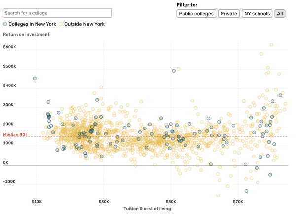
As a data reporter at Times Union, I produced data-driven stories from pitch to publication—sourcing and analyzing data, shaping angles, visualizing findings, interviewing sources, and writing under tight deadlines. Almost all ranked among the top three most-read stories that day.
I also collaborated with developers, editors, and reporters across beats to produce large-scale data projects and interactive tools, including a comparison of New York colleges’ ROI with schools nationwide (below) and a projection of first snow dates (coming up).
During my time at SFC, I reported data-driven, scoop-worthy stories across beats by analyzing data with Python, interviewing key stakeholders, and creating interactive visuals using Datawrapper, Mapbox, and JavaScript.
In addition, I collaborated closely with reporters across teams to develop data investigative stories, scraping and sourcing hard-to-find datasets, uncovering patterns and outliers, and helping shape investigative angles with data findings and interviews.
These projects were completed during my time at Columbia University from the fall of 2023 to the summer of 2024.
I used Python, R, BeautifulSoup, Pandas, Playwright, ggplot, matplotlib, SQL, Mapbox, DataWrapper, Inky, Adobe Illustrator, and "scorytelling" to tell various stories with data and graphics in beats of education, criminal justice, business, social inequality, culture, environment, transportation, and health.
I built this website with code. The stories included are the same ones as shown above.